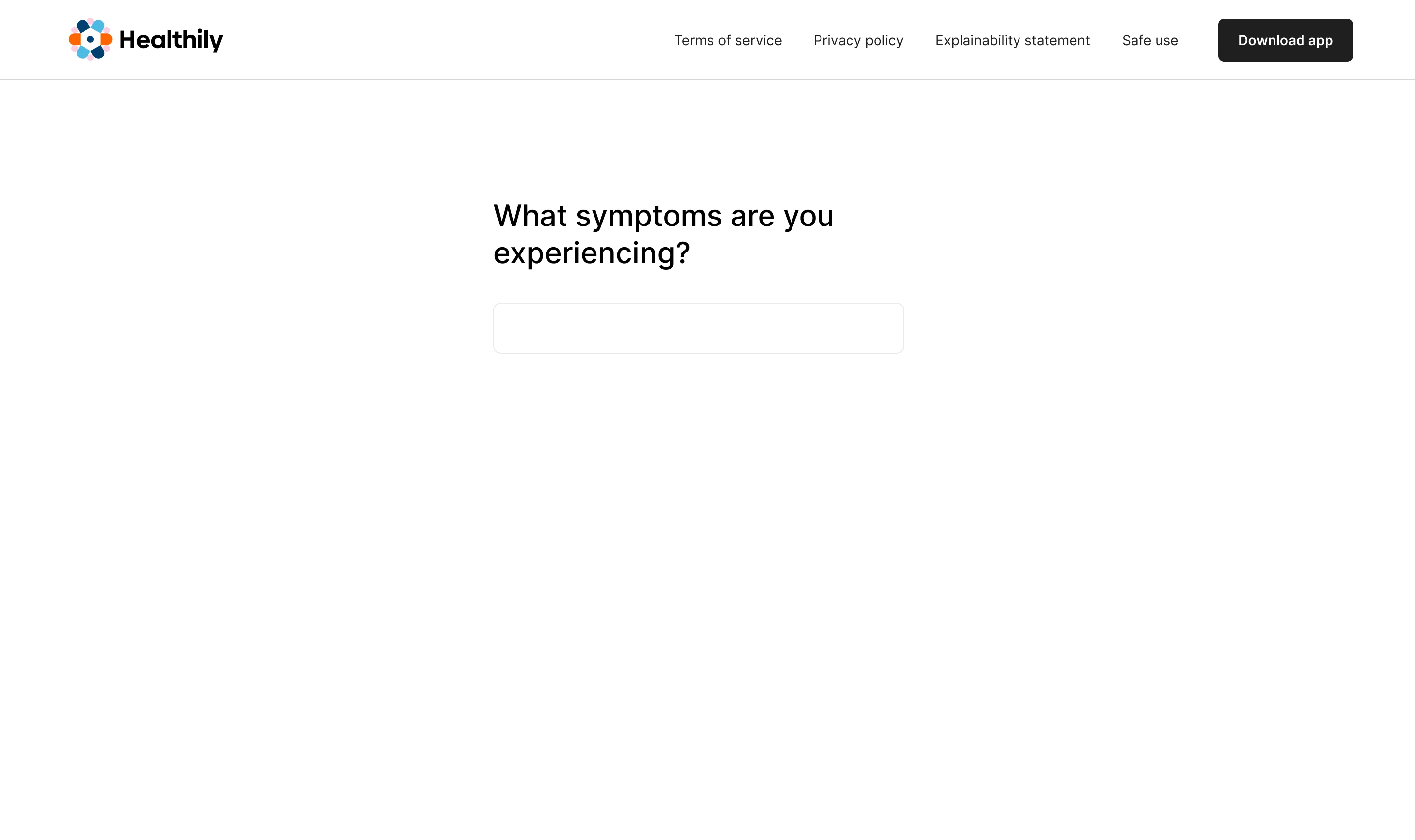





Funnel analysis and user research traced the drop-off to the symptom input
Healthily began in 2013 as Your.MD. By the time I joined, its AI symptom checker was a legacy system. I came in to update the outcome screen. My research showed the input needed modernising first, so that became the job.
"I couldn't find the words for what I was feeling."
The system worked as built, so I traced it end to end. Mixpanel drop-off tracking pointed to the first field. I compared what users typed with the diagnoses they ended on. The gap opened at the input. Fifteen interviews and eight usability tests showed why.
Users could not find the right words for a symptom. They were unsure which details were worth mentioning. They wrote long, skipped the specific part and guessed the spelling. The model worked as built, and users still ended up with lots of similar symptoms and never the one they meant.
The checker was a Class I medical device, so any change to the input flow triggered clinical re-validation. I made the call to keep the NLP and modernise around it, a direction my competitor research had pointed to.
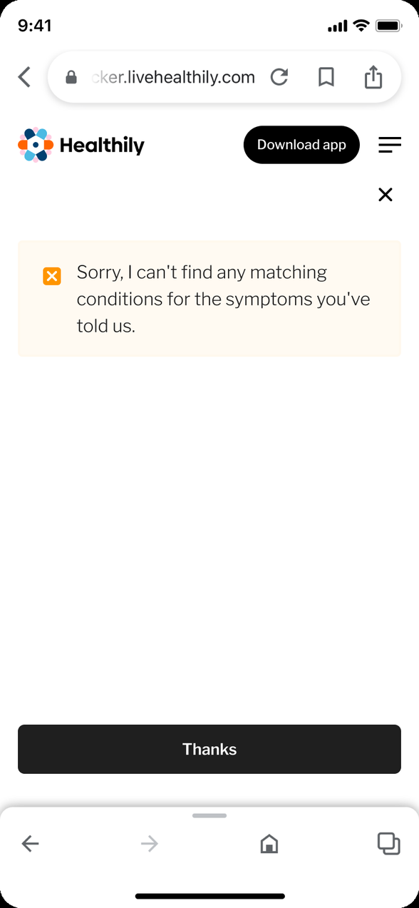
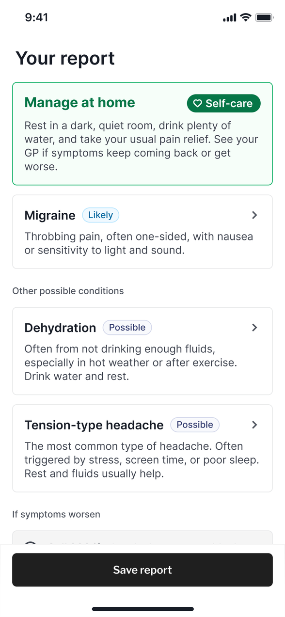
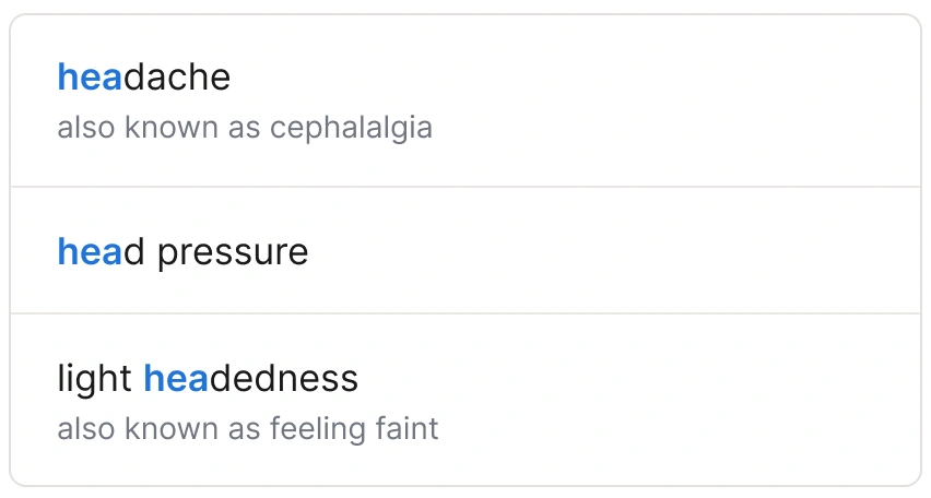
It was a full version update: the frontend of the symptom checker and the backend symptom ontology, two systems redesigned together. The old version was natural language processing alone. The new one works as a translation layer between medical terms and everyday language. Autocomplete starts after three characters, each suggestion carries its “also known as” names, and the checker shows back what it heard so users can add or remove symptoms. The checker asks for further detail through progressive disclosure, at the moment the user needs it.
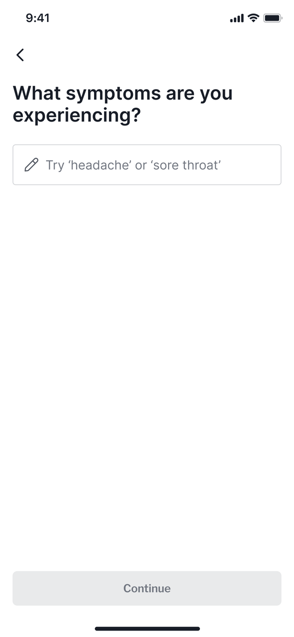
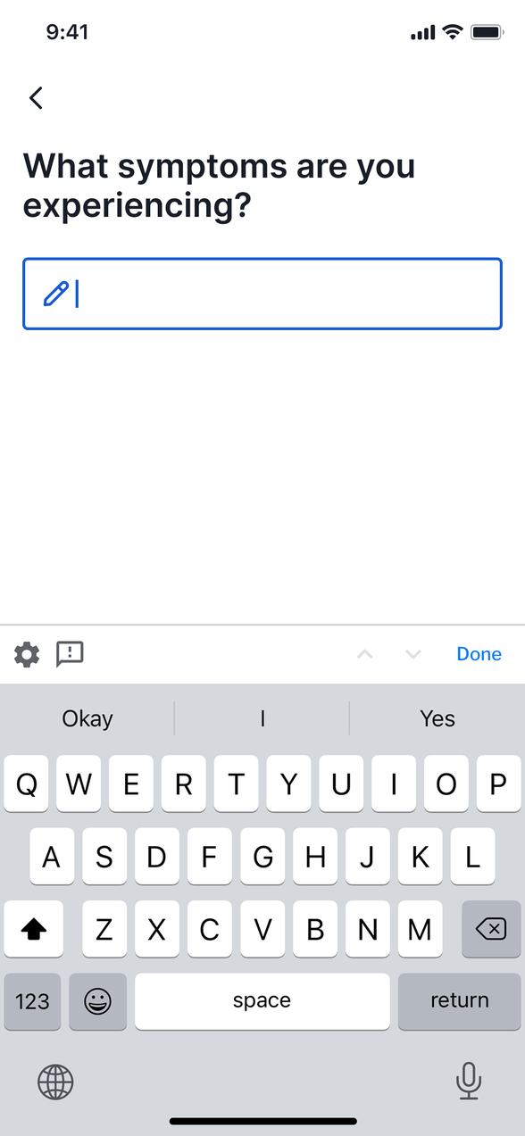
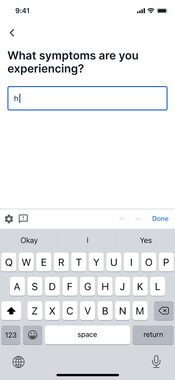
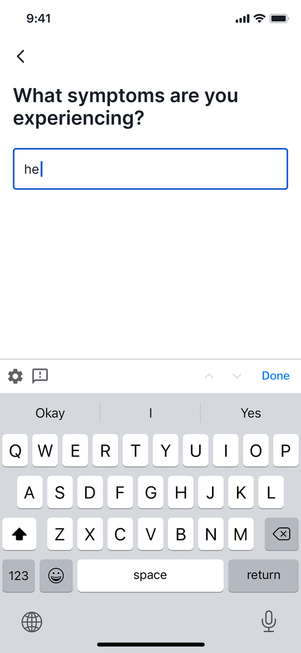
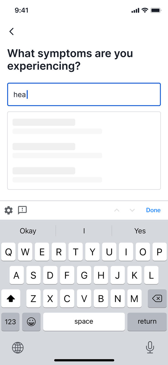
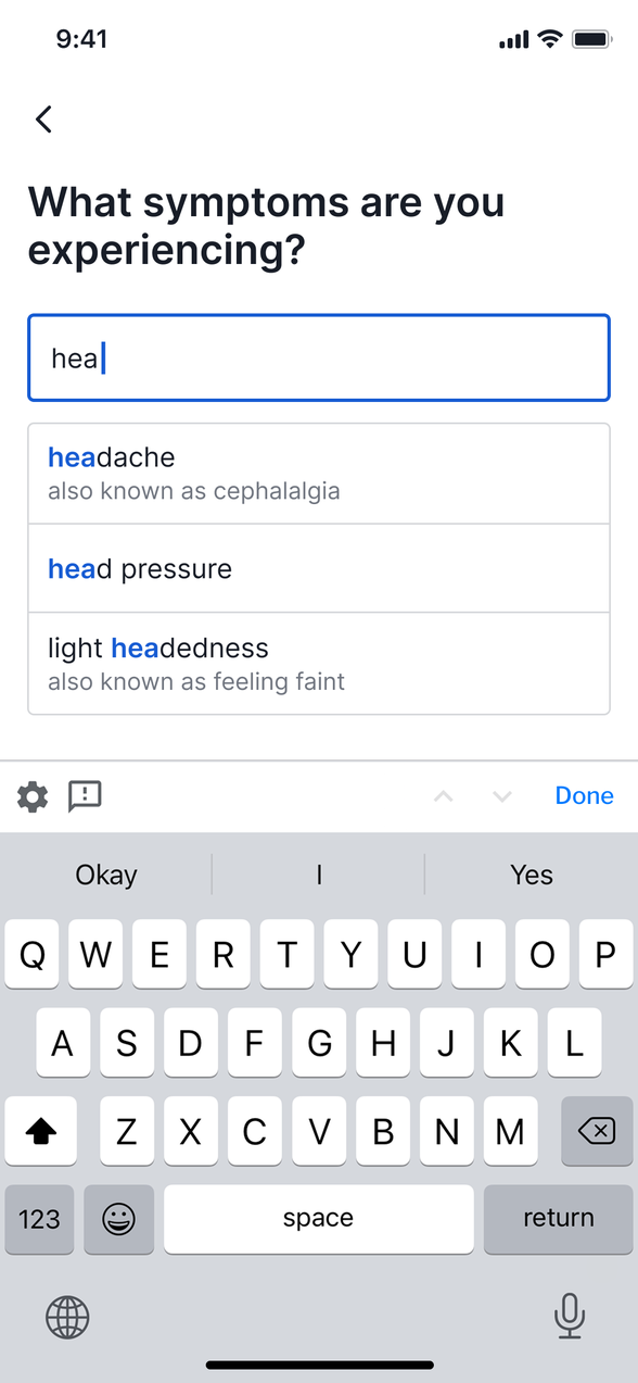
1 Suggestions as you type
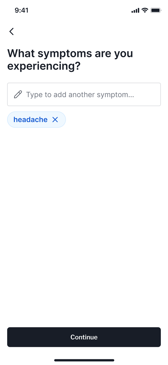
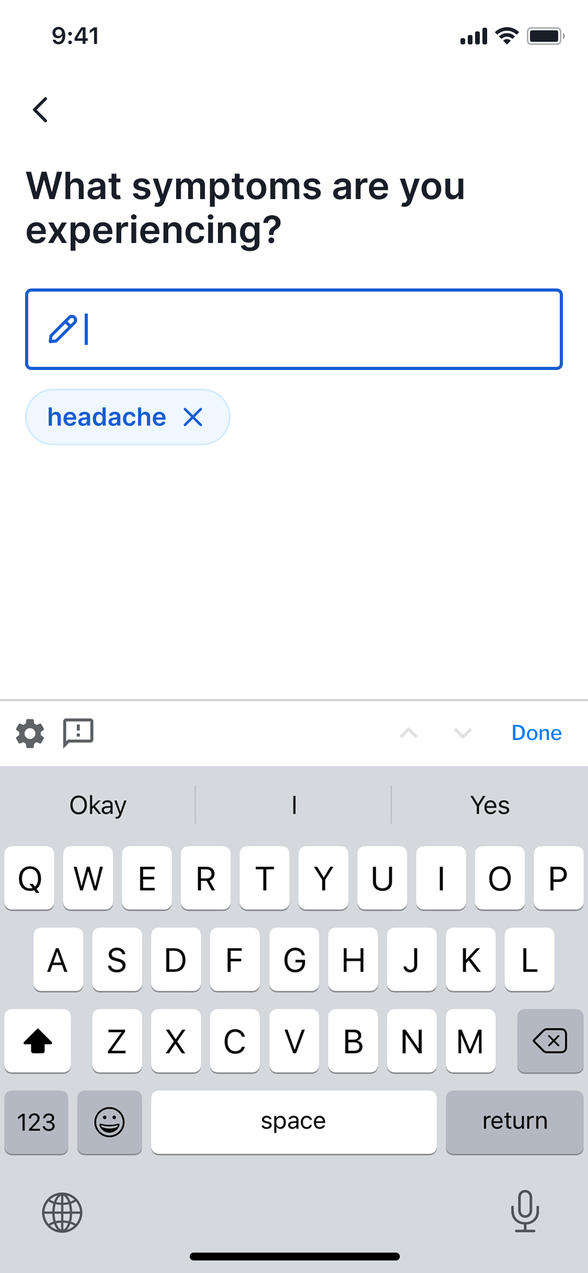

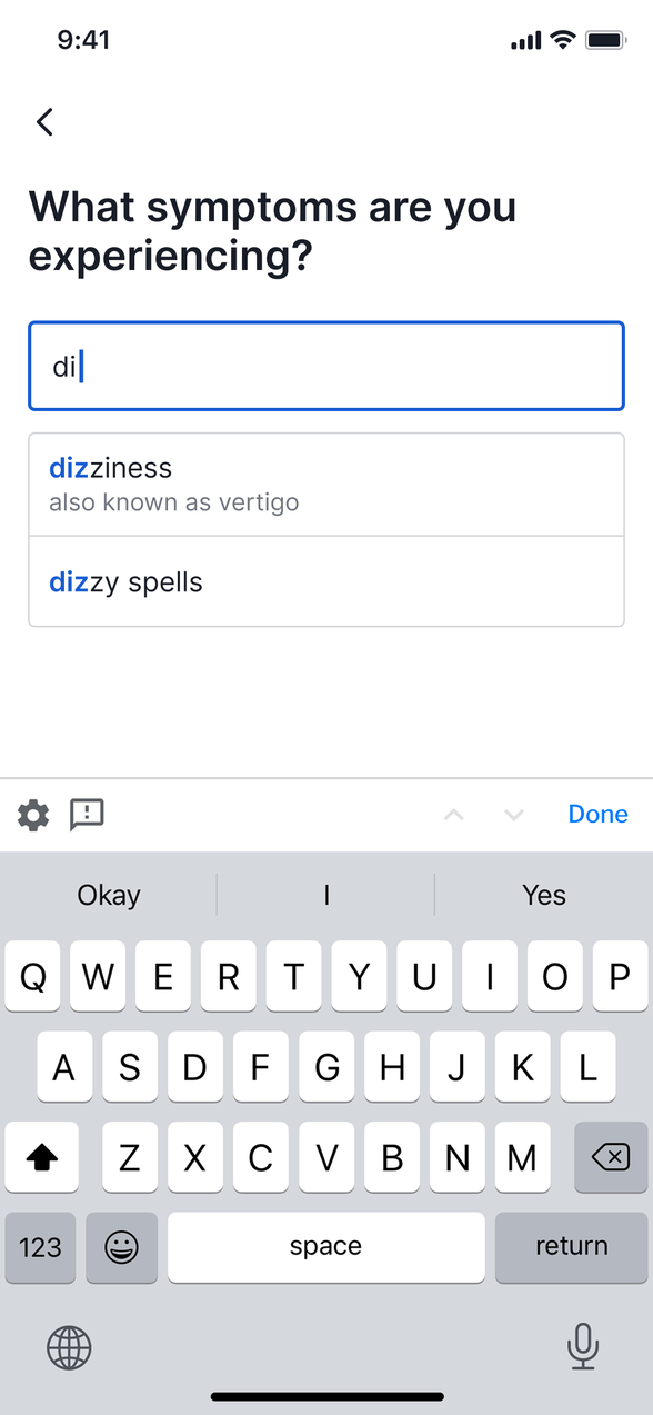
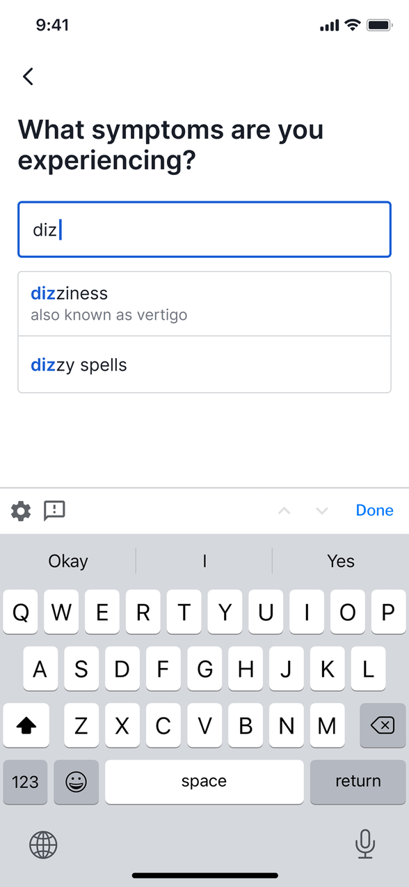
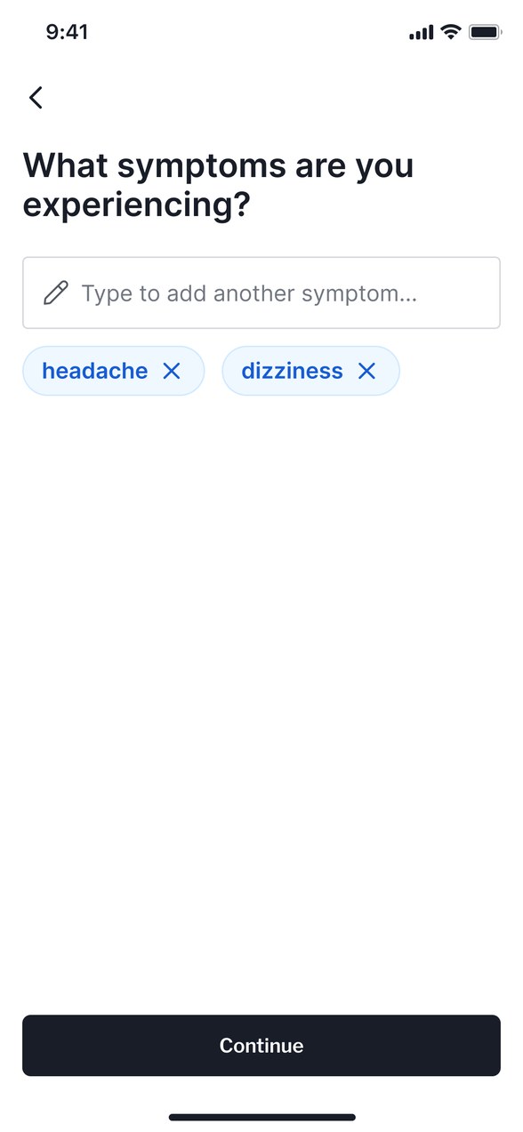
2 What it heard, shown back
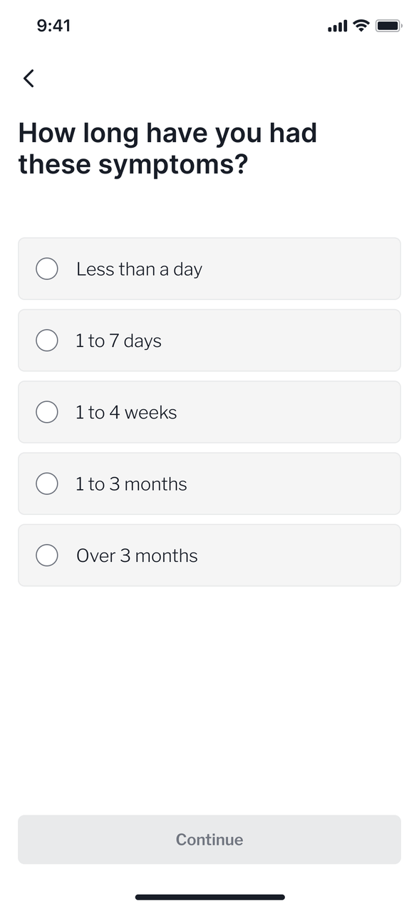
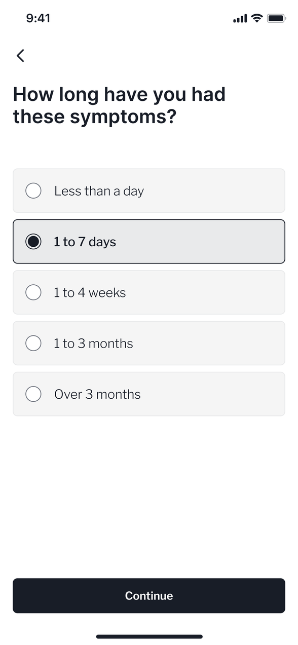
3 The consultation
4 A report at the end
Symptom input · however a patient types it
Recognition and triage- Self-care at home
- Pharmacy
- See a GP
- Urgent care · 999emergency
I led the clinical knowledge base and symptom ontology behind the AI
Under the search box sat MediBase. I structured it and led it: every condition, its symptoms, its warning signs and the rules for what the checker could safely ask. GPs from the in-house clinical team tested and signed off every mapping before it went live. The medical decisions stayed with the clinicians. I built the system they used to make them.
I extended the symptom ontology so every everyday name links to the clinical term behind it. That link is what lets a suggestion appear after three characters. Feedback mechanisms then kept improving what the AI understood over time.
An A/B prototype test put everyday names under each clinical suggestion
It was a big change to the checker, so we staged it to learn how best to roll it out. The test asked whether the “also known as” names helped users, and which presentation worked best.
Two prototypes went in front of users. A was autocomplete alone, the smaller build. B showed the everyday names under each suggestion, so users could recognise “runny nose” without knowing the medical term, plus a way out when nothing fitted.
A tested worse. Autocomplete hands you a list, but no way to check the medical term is the thing you meant. People wanted their own words back before committing.
B added a step, and completion did not fall. Satisfaction rose from 62% to 67%.

I owned the checker and its design system across three products
The checker lived in three places: the consumer app, the web app and the public site, each built by a different team. As design lead I owned it across all three, with a junior designer and a brand designer, end to end: discovery, user research, prototyping, the build and what came after.
I set the design system, the interaction patterns and the wording. I aligned product, engineering, clinical, legal and commercial teams around one source of truth, so the teams agreed a change once and shipped it everywhere.
The result: a symptom looked and read the same at every touchpoint.
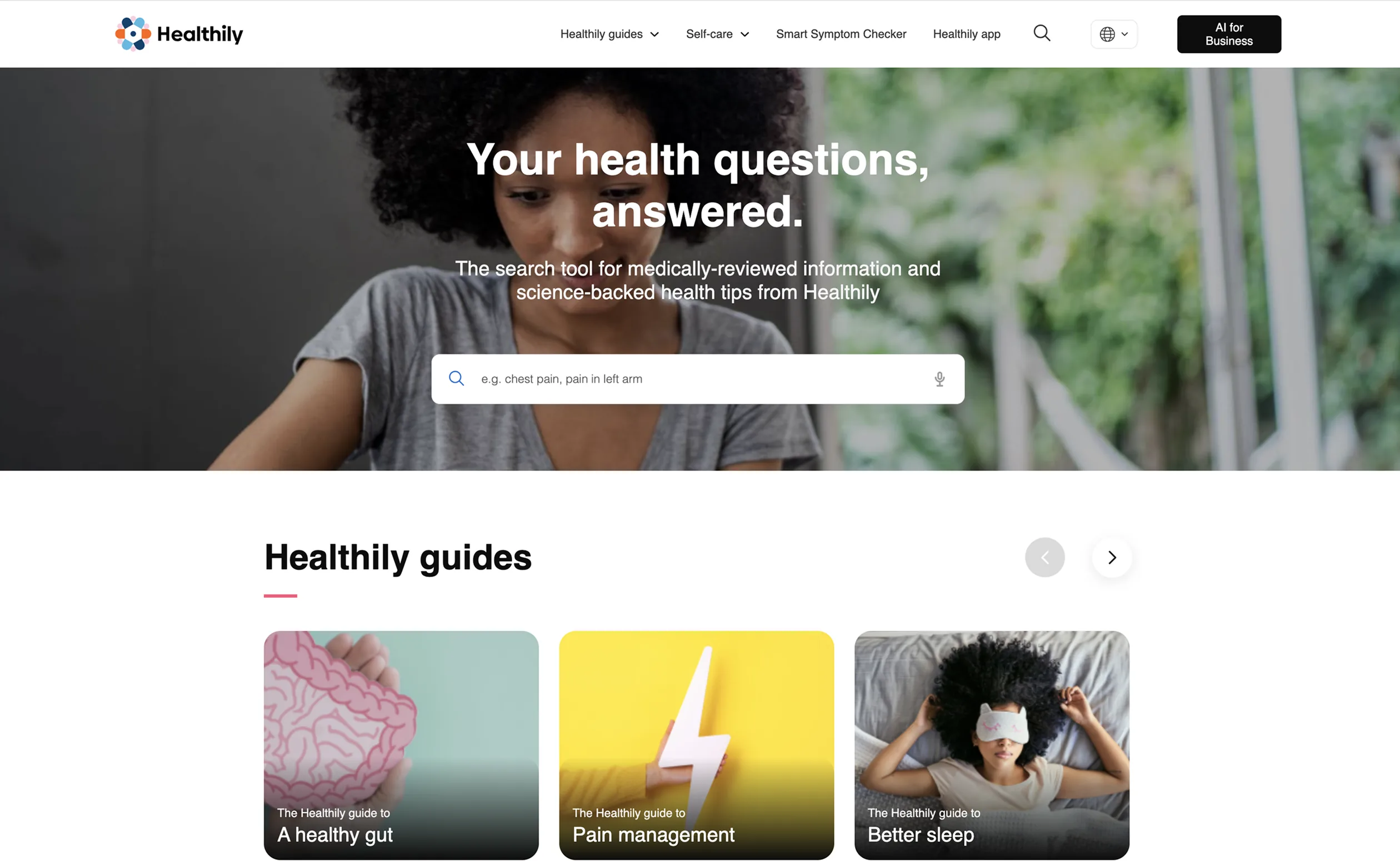


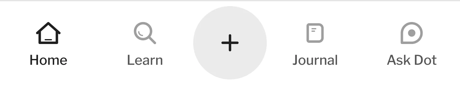
The homepage, top to bottom.
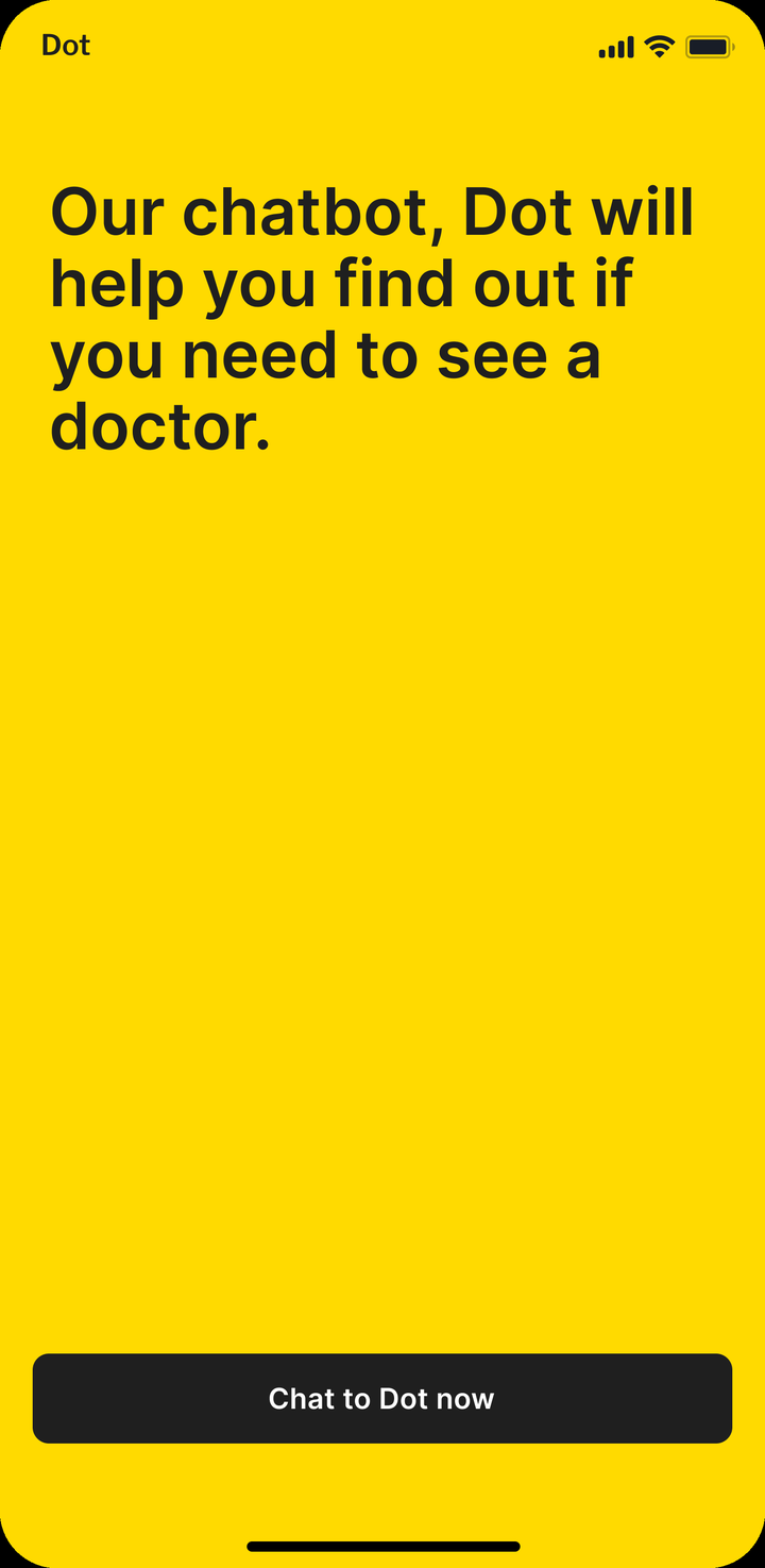
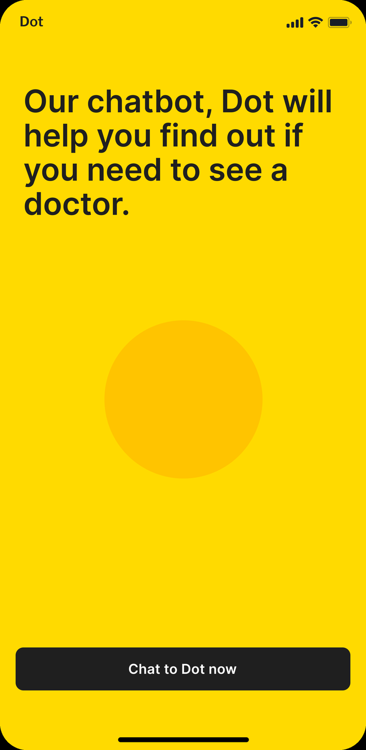
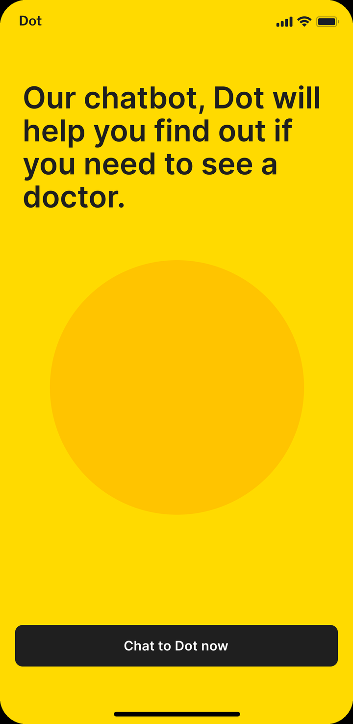
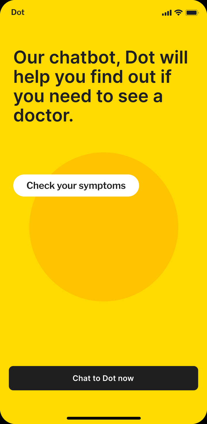
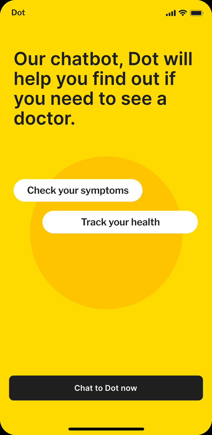
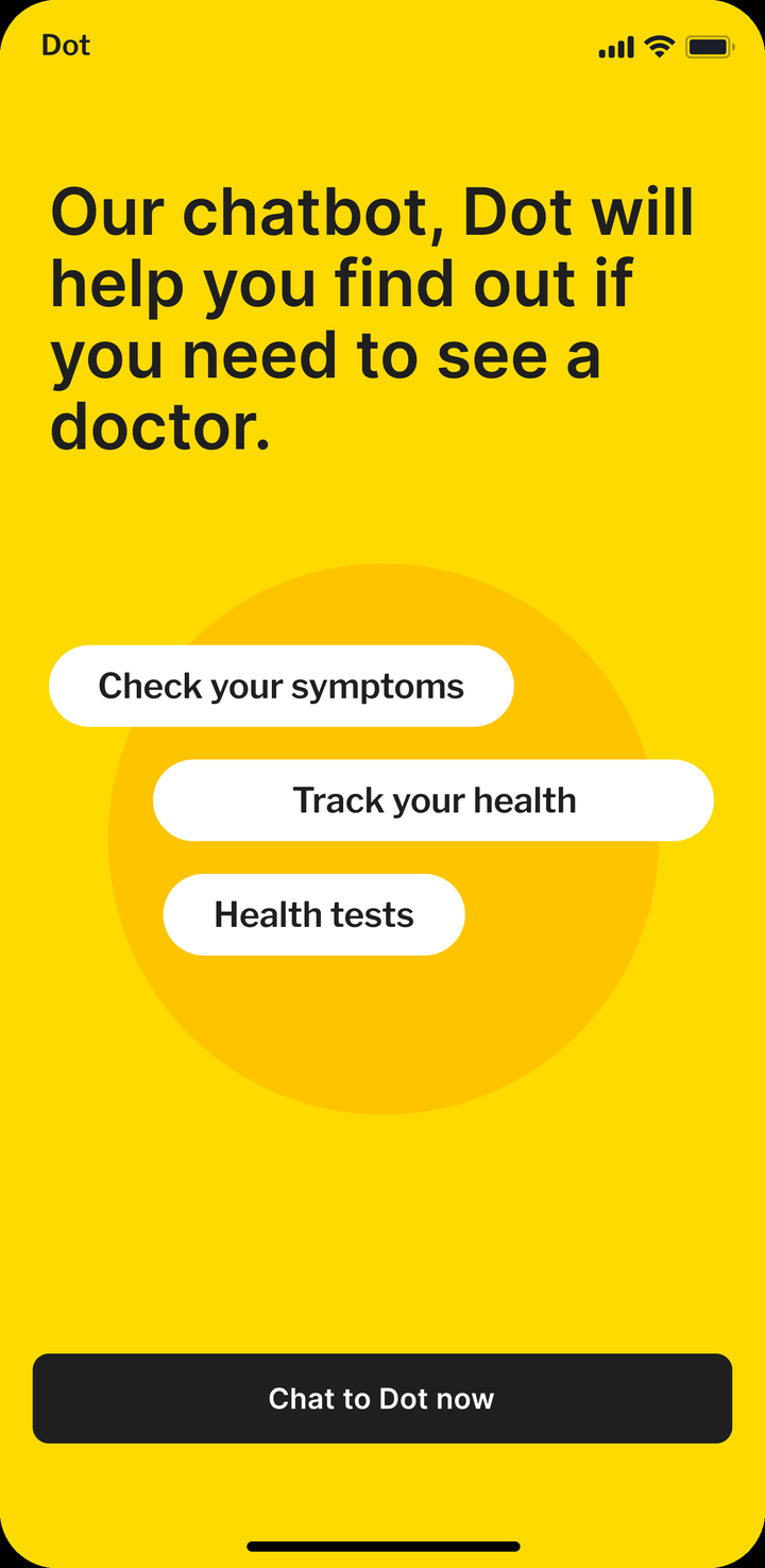
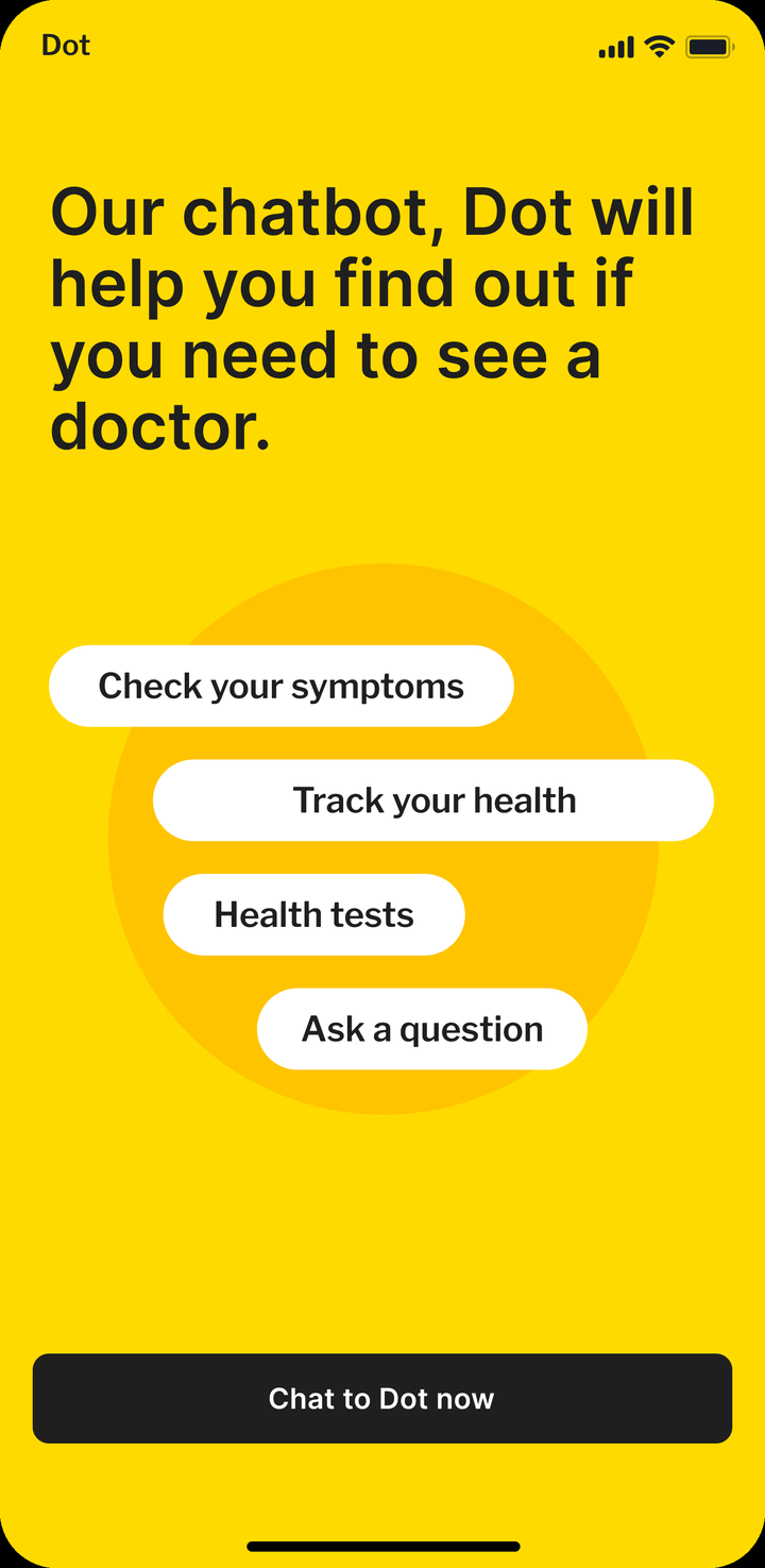
The home for Dot, the symptom checker.
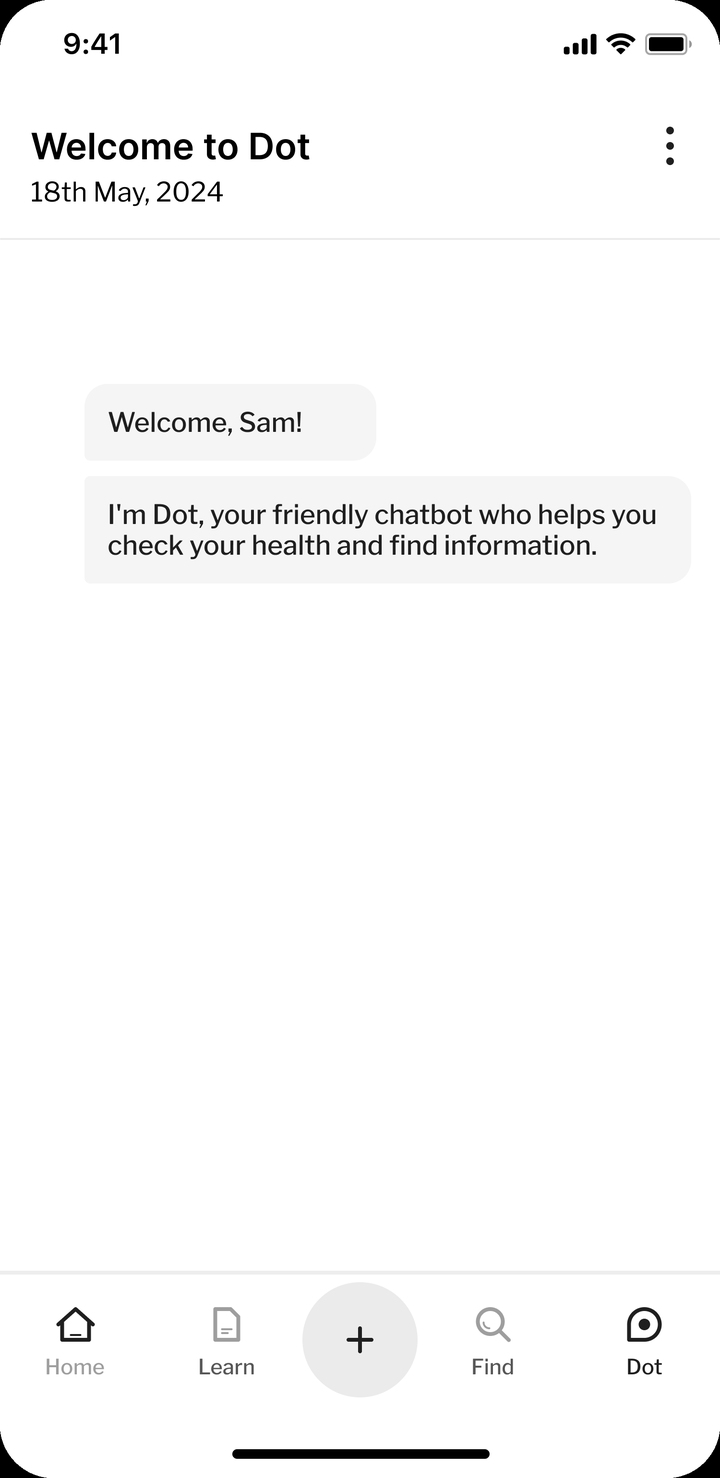
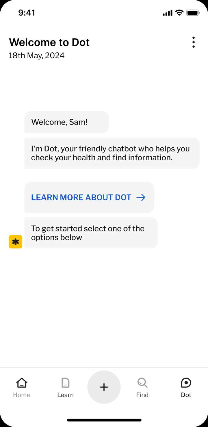
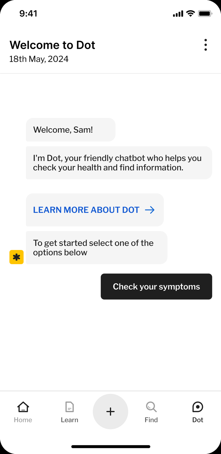
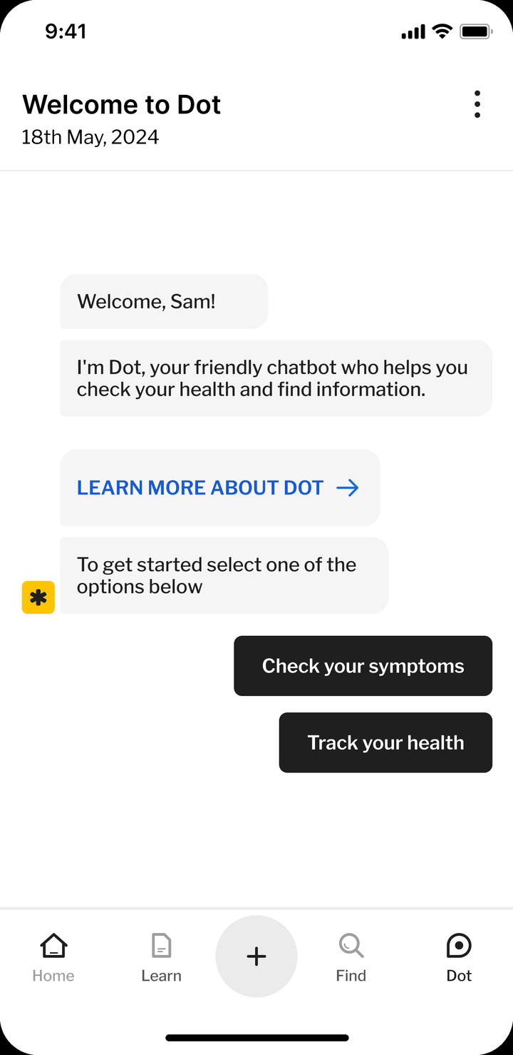
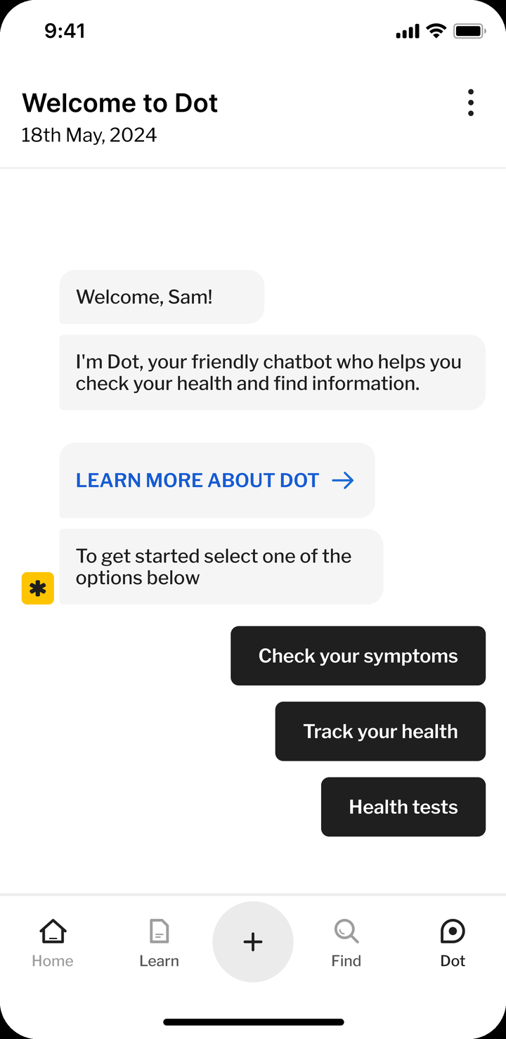
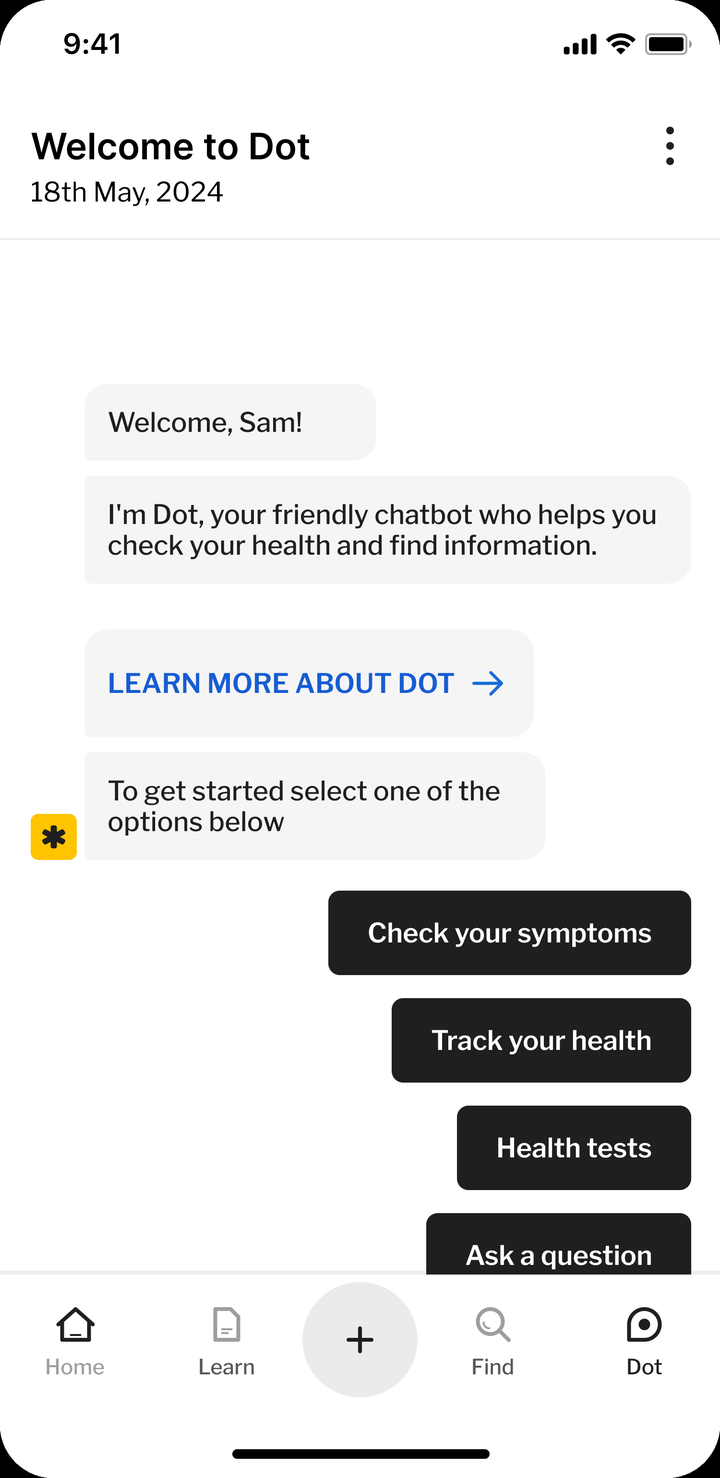
Dot greets you and offers a route in.
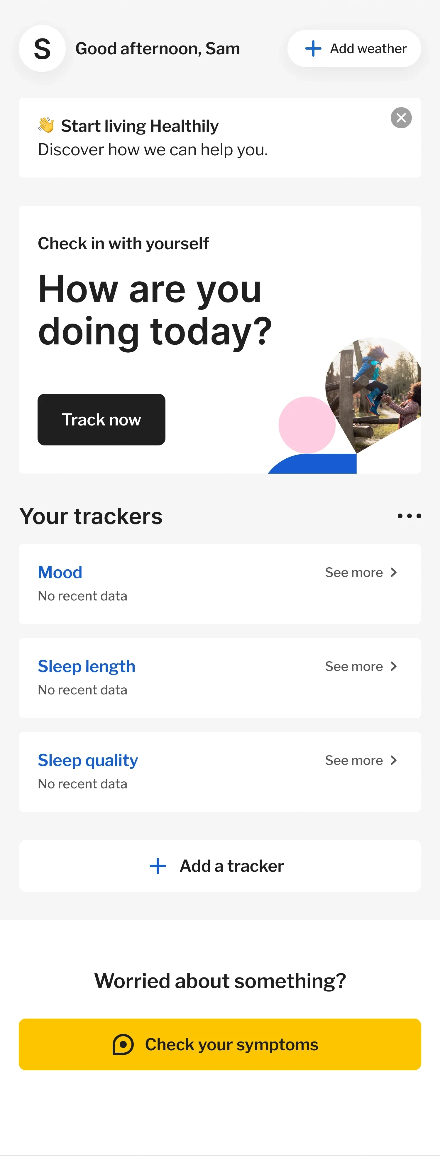


Your day and your trackers.
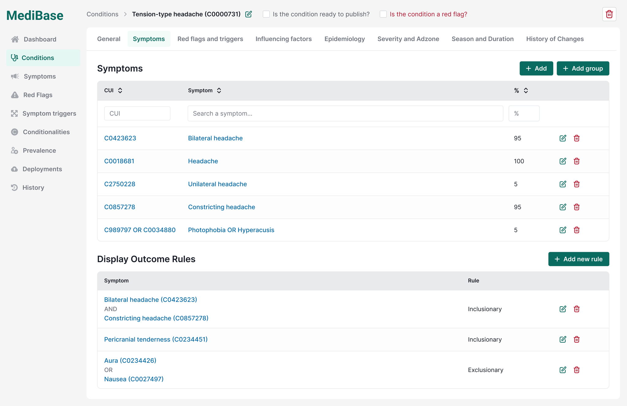
- 1Publish + red-flag gatesNothing reaches a patient un-reviewed.
- 2Symptoms keyed to UMLS CUIs, weightedWeighted scores across coded symptoms decide the outcome.
- 3Inclusion / exclusion rule engineThe logic that decides each outcome.
Accuracy rose 23% and one-star ratings halved, backing Class IIa certification
Symptom-description accuracy rose 23%, measured on completion outcomes. More users finished. After autocomplete launched, one-star consultation ratings halved, from 13.1% to 6.6%. One tester said: “It helps you describe symptoms more accurately.”
Whatever a user typed now routed them to the right place: a GP, a pharmacy or self-care. Red flags were never softened. Chest tightness still ended in a call to 999.
In under a year we modernised the checker end to end, frontend and backend. There was more to do, starting with the everyday-name dictionary. It then went from Class I to Class IIa under EU MDR, a certification based on this work and awarded after the improvements were in.
MediBase ended up with every condition, symptom and red flag coded to UMLS.
How a symptom is entered shapes user trust and commercial outcomes
The brief was the outcome screen, the last step of the flow. My research traced the cause to the first step, the symptom input. From there, I led the work end to end: qualitative and quantitative research, the build, the launch, the iterations and the post-launch analysis. Metrics backed every decision, and I balanced user trust against the business numbers without trading one for the other.
It proved that how a symptom gets typed in shapes both user trust and commercial outcomes. If I did it again, I would grow the everyday-name dictionary from unmatched searches from day one.